Writers, artists, composers, mathematicians.. Everyone knows how terrifying a blank white page looks. The void stares back at you, daring you to desecrate its pure surface. Anything you type, write, sketch out, or even think about seems unworthy to break its fresh appearance. Once you’ve gotten into it, though, your experience carries you through. Nothing is ever as hard as starting something new.
The funny thing is, a blank slate has the most potential of all. It can be anything you want it to be. And that’s exactly what’s so frightening about it.
Getting around it
One way to overcome blank canvas syndrome is to make any kind of mark; some may even advocate for as messy of a mark as possible. It could be just a scratchy doodle, or a blob of paint, or a rough beat-boxed rhythm, or some quick notes about the ideas we want to convey. This “ruins” the blank slate and helps put us in a spot (as well as a headspace) where we can figure out the gradient of improvement, from which we can take advantage of happy accidents.
For art
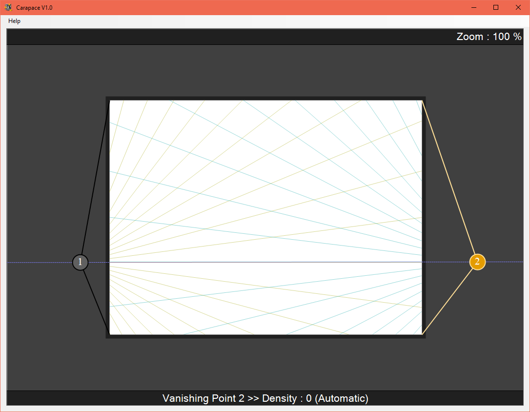
For the literal blank canvas, I installed this program called Carapace, which is a perspective tool created by Epic Games’ art department. It is an easy way to generate perspective lines that can be customized and pasted into anything. Seeing the lines helps me visualize what I want to design, and makes me feel less about marking up a clean surface.
You can get up to, if I remember correctly, 10 vanishing points on one canvas. If you could ever think of a situation where you would need that many.

An interesting approach is the “marker first” method. This involves using a very large, low opacity brush (or marker, if you’re working in traditional media) to work out the basic forms. Feng Zhu and his design cinema series on YouTube go more into this; his methods of dealing with a blank canvas are quite helpful for those wanting to get into his type of work.
Another tactic I’ve used to reduce the intimidation factor on a fresh page is download (and make my own) custom Photoshop brushes that have some kind of texture in them. This helps extract the forms a bit, and works similar to the marker-first method with the added benefit of a bit of texture gifted to us with modern technology. It feels super cool to just lay down a gritty concrete texture, or to generate some foliage just by dragging a brush across the screen. Feng Zhu also talks about using photos in a non-traditional way, by clipping, rotating, and pasting them all across the canvas to generate a sort of random noise that also contains realistic details with the photographic quality of the random shapes. This way you also avoid copyright problems with creative commons, since very little of the original photograph is left over at the end; it becomes nothing more than a texture. Or, of course, you could just use your own photos. If you’re cool like that.
I think ultimately the purpose of this is to eliminate the fear of something huge and white staring you in the face, and perhaps even gaining some kind of advantage in the process. There are many ways to get over this, and it all depends on what you’re comfortable with. The anxiety goes away once you are comfortable, so the point is to get comfortable. So pull on those sweatpants, sit unflatteringly on that couch, and start dirtying up that blank page to get the creative sodas flowing in.